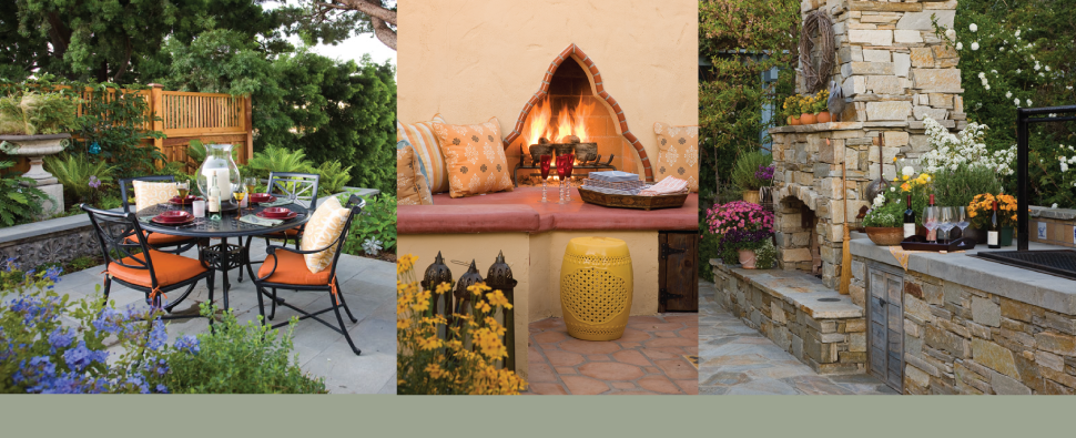
Sage Outdoor Designs » landscape design

Masthead header

Modern minimalism in the desert: Amangiri resort

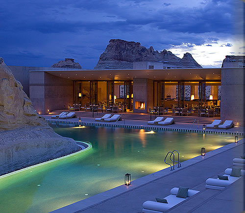
I am completely blown away by the design of this place! This is everything I love in one design: integration with the natural landscape, clean modern lines, creative minimalism, gorgeous use of water elements, and plants that actually belong.

From the resorts website: Amangiri, ‘peaceful mountain’, is situated on 243 hectares (600 acres) in Canyon Point, Southern Utah, close to the border with Arizona. The resort is tucked into a protected valley with sweeping views over colourful, stratified rock towards the Grand Staircase – Escalante National Monument. The resort is a 25-minute drive from the nearest town of Page, Arizona and a 15-minute drive to the shores of Lake Powell. Architecturally, the resort has been designed to blend into the landscape with natural hues, materials and textures a feature of the design. The structures are commanding and in proportion with the scale of the natural surroundings, yet provide an intimate setting from which to view and appreciate the landscape.

Fun with modern hanging glass planters

Some eye candy for today, thanks to my fabulous landlord Lorrie Webb: this dreamlike arrangement of hanging glass planters that she spotted on her trip to Sweden. There is something so peaceful about this, don’t you think?

The plants: Jade plant, Mother-in-law tongue, pathos Ivy, Needlepoint Ivy, Rubber plant.


Porcelanosa: modern tile with a European flair

I find something particularly fascinating about tiles that have a tactile quality to them (if I was being snotty, I’d call them bas-relief, which is the arty name for anything that is slightly three-dimensional), so I have had my eyes on Porcelanosa for quite some time.

This one is their “London” line: they are large format porcelain tiles that fit snuggly together to form a wonderful repeating pattern. They look glossy in the image but in reality they are actually fairly matte, and the three-dimensional quality of them is reinforced by the fact that the curves are flattened on the top, giving them an almost Asian modern feel. They make you want to run your hands along the wall as you walk past!


Finally! I found a cobble you can use in a fire pit!

We’ve all seen photos of fire pits filled with beautiful river cobbles. I, for one, love how it looks. But do you know what happens if you actually put river cobble in a fire pit and turn on the flame? The rocks start to heat up, and any little trapped pockets of air inside the stone start to expand, but since they have no where to go, the stones explode! They go off like gunshots and will ricochet around your yard. Seriously.You could hurt someone.

The ones you see in magazines that look so good are probably fake cobbles made out of ceramic. Rasmussen sells them here. But for the longest time, I have been wishing for a real cobble to use in there instead. And these lovely little guys are the solution: Mauna Loa Black Lava cobbles from Southwest Boulder and Stone. You just can’t hurt lava with fire.

As an extra bonus, they are full of tiny holes that help to diffuse the gas so the flame looks much more natural. A win win.

What do you think of 2013’s color of the year?

Pantone has released their pick for 2013’s Color of the Year: Emerald Green. At first, I wasn’t sure if I was sold, but the more I look at it, the more I am on board with this trend.

They claim it is “Lively, radiant, and lush, a color of elegance and beauty that enhances our sense of well being, balance, and harmony.” Translation: all at once it manages to remind us of crisp polo-shirt wearing Wimbledon fans, happy days spent as children watching the Wizard of Oz, and a slow walk through a serene leafy forest. How can one color do that, you ask? Well, shucks- I have no clue. But it makes me feel wealthy just looking at it.

Actually, it scares me a bit how right Pantone typically is with their color picks. Last year (2012, that is) it was a deep orange-red that they called Tangerine Tango. And yes, I did paint the accent wall in my office just that color. And 2010 was Turquoise… and well, you all remember my almost embarrassing obsession with that color.

And yes, I did skip 2011 on purpose- they named a sherbert pink they call Honeysuckle, but I beg to differ there. I think it should have been a rich plum purple. For a while there, I couldn’t stop buying purple things, and I’ve noticed it even started showing up recently on tennis shoes. I think that might be the end of the line as far as a color trend goes.

I learned recently (from my good friend Feras Irikat of Oceanside Glass tile) that it typically takes two years for color trends from world of high fashion (the runways) to make it into the home. So that gives us a little time to decide if this one really is a winner. What do you think? Would you use this color?